Sprint 30
2 August 2018 to 15 August 2018
Done
- Added abilty to place 2 charts next to each other (in 2 columns)
- Added 'on this page' and 'in this collection' navigation to the sidebar
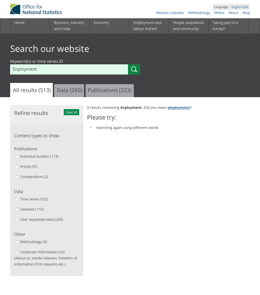
- Did a spike into search re-indexing performance
- Made the publishing team's content managment system more performant
- Combined the preview site that other departments use, into the main content managment system
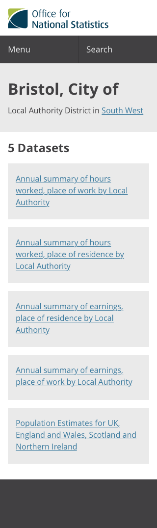
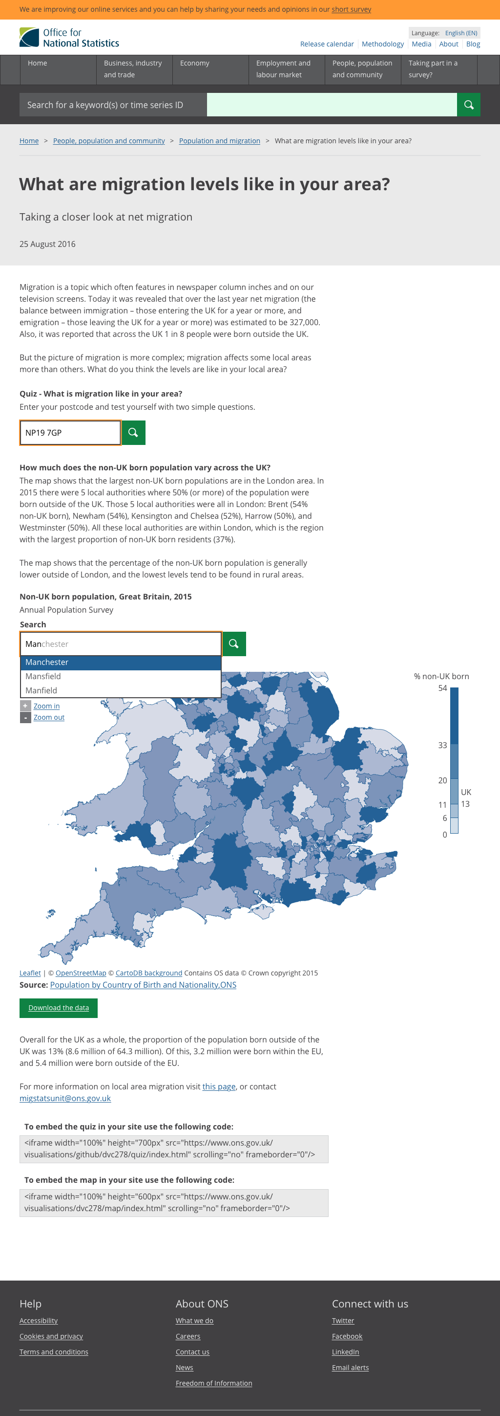
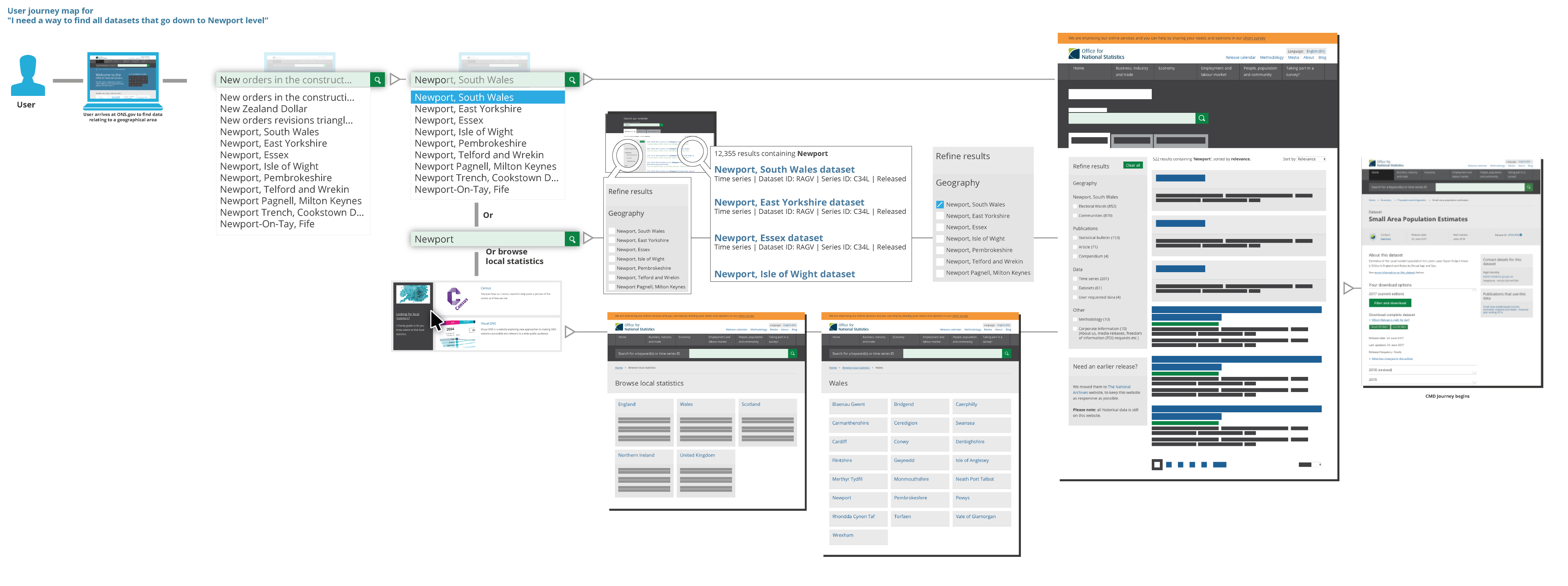
- Find data by area – iteration 3
- Update on the new production environment
Sprint 29
19 July 2018 to 1 August 2018
Done
- A card sort to help understand what words users use to describe bulletins
- Reviewed analytics from the GDP bulletin prototype
- Started supporting JSON-LD (Linked Data) format in the Dataset API
- Learnt about encrypting large files (Trade data has 14.5 million observations)
- The service team are leaving :(
Sprint 28
5 July 2018 to 18 July 2018
Benjy went on holiday
Sprint 27
21 June 2018 to 4 July 2018
Done
- Search prototype that learns from users by matching words like 'murder' with 'homicide'
- Started adding common code lists (for example geography or sex) to the API
- Prototype for GDP bulletin
Learnt
- Users who filter datasets are mostly interested in geographic areas
- 72% of users select 'all' when filtering datasets by sex
- Long lists of areas have a sharp drop off of use after 20 items
- Usabilty testing is showing that users of the bulletin prototype don't understand how to navigate on and between the bulletin pages
Sprint 26
7 June 2018 to 20 June 2018
Done
Learnt
- Bulletins: new format makes no real impact on data users, they aim for the data and are gone
- Bulletins: users need to be clear on purpose of related content if it’s part of the same output
- Bulletins: there are users who want to read all of a bulletin – we need to make sure they don’t miss anything
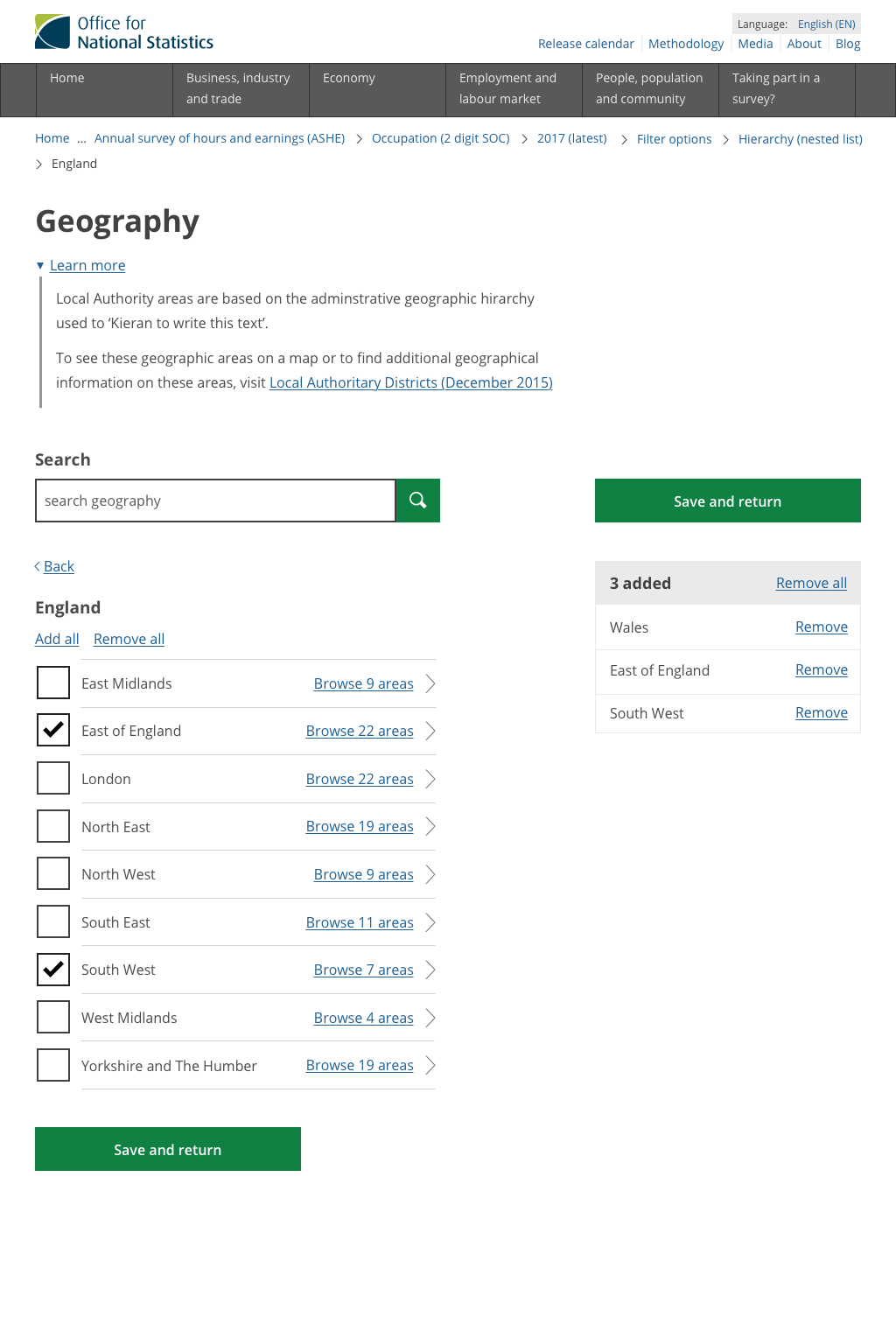
- Geography: users expect to navigate down through geographies to get to lower levels
- Geography: users expect markers on maps – towns, cities, something to help identify maps as specific areas
- Geography: if maps are a method of navigation, they need identifying – either stamped with area name, or hover over, or both
Sprint 25
24 May 2018 to 6 June 2018
Done
Learnt
- We should always add hyperlinks when documents are mentioned in the text
- The large blue page intro area might discourage scrolling
- Charts and key figures need context so they can't be misused or misunderstood
Sprint 24
10 May 2018 to 23 May 2018
Done
Sprint 23
26 Apr 2018 to 9 May 2018
Done
Learnt
Sprint 22
12 Apr 2018 to 25 Apr 2018
Done
Sprint 21
29 Mar 2018 to 11 Apr 2018
Done
Learnt
- Codes confuse inexperienced users: “I have no idea what this is”, “codes were the first thing I saw and I thought what on earth is that”
- Users aren't sure where the "save and return" button will take them
- Terminology: ONS language doesn't always match with users' language (for example, homicide or murder)
- Users don’t understand index information – ie. Jan 1987 = 100
- Users felt descriptive section headings in were useful “you can still take something from the heading alone”
- Users scan for information – if they are looking for something specific, often they can find it, and perhaps then read more of the text around that figure
Sprint 20
14 Mar 2018 to 28 Mar 2018
Done
Learnt
- Users are not seeing the sticky table of content when using bulletins
- Users expect auto suggest/correct within search
- Most users use the breadcrumbs to find “related content” (not the sidebar)
- Methodology navigation pages need to be improved (e.g. improve content and hierachy of pages) as some users struggle to find their way around
Sprint 19
28 Feb 2018 to 13 Mar 2018
Done
Learnt
- We need to do some work optimising for mobile
- A/B latest release designs results - Results show iteration is a clear improvement. with the proposed design scoring over 90% against the original. We are now confident to make proposed changes to website
- Users want filters to have default options e.g. sex: all and geography: UK
- Users want age ranges - but these need to be added to the original dataset before we can present them as options
- Users want to know what geography levels are available in a dataset e.g. LSOA
- Over 50% of our users in CMD only selected 1 filter per option
- Users clearer about next steps when rewording ‘back’ to ‘back to next level’ in geography hierarchy
- Users like the idea of dataset families - but split on whether this should be *detests* within a release, or all datasets on a theme - we need to find out more
Sprint 18
14 Feb 2018 to 27 Feb 2018
Done
Learnt
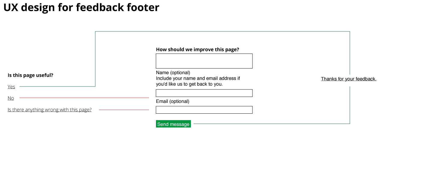
- Regular users are trained to the green "I just look straight for the green button"
- Users want a quick way of adding a geography level, and all underneath it
- Maps can help users pick geography areas when only geography codes are available
- Users like maps
- Users appreciate being sent to different datasets when their actual ‘wants’ don’t exist
Sprint 17
31 Jan 2018 to 13 Feb 2018
Done
Learnt
- Users quickly learning how CMD works, can transfer learning to other datasets, in particular hierarchy structuring
- We need to add area type ie. West Midlands (region) West Midlands (metropolitan county)
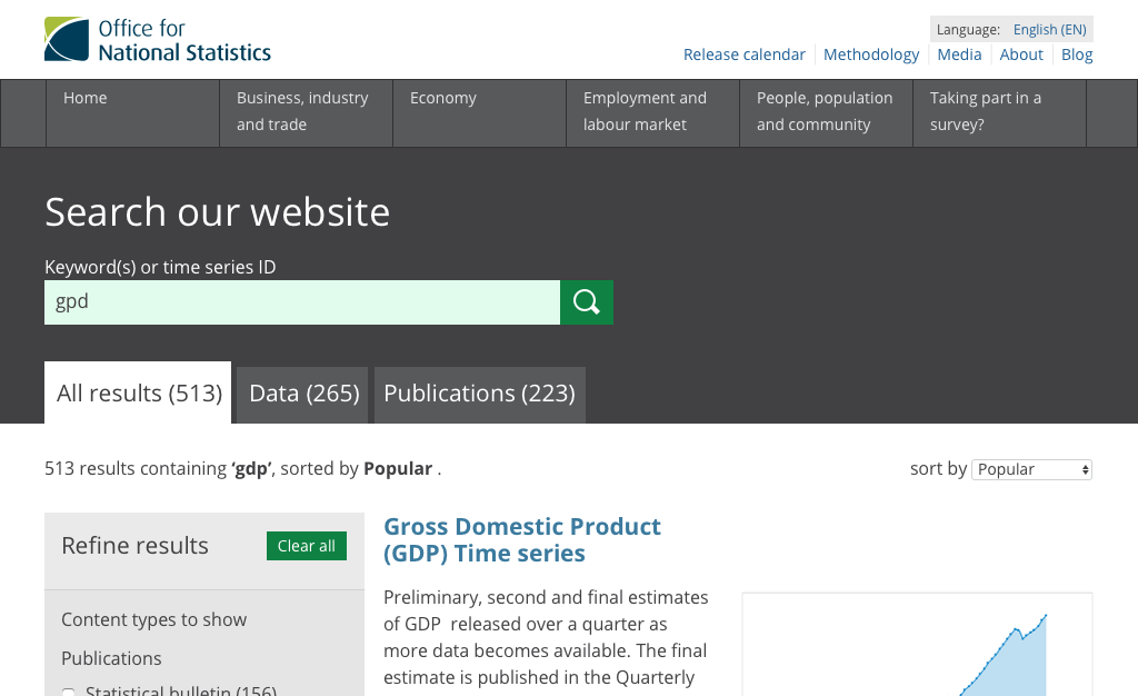
- Search will make things quicker for users
Sprint 16
18 Jan 2018 to 30 Jan 2018
Done
Learnt
- CMD user do not genrally know much about ONS geo products, these are two different spaces
- Users are not confident using a hierarchy, using the 'save and return' button, rahter then trust the auto save function
- Users want to perform a search within a page
Sprint 15
4 Jan 2018 to 17 Jan 2018
Done
Learnt
- There's a big drop off when users reach the preview page - they aren't downloading
- Ages and years should be listed in order
Sprint 14
14 Dec 2017 to 3 Jan 2018 — Christmas edition
Done
- Improved preview table to give extra visual cue when the table overflows the container horizontally.
- Updated the web tests
- Explore ways to programmatically create hierachies with sparsity. Also known as, how can we enable users to select data at low levels, when the parent levels have no data associated with them.
- Improved Excel download file: optimised column width for faster file generation, split common dimensions into seperate cells, switched formatting so that time dimension goes along the top.
- Mocked-up designs for how we can expose links to geospatial data when users are filtering datasets (dataset landing, filter page, preview page)
- Iterate on the "find data by location" prototype
Learnt
Discovered 2 core user needs for the Open Geography Portal:
- I want text-based info on a boundary or set of boundaries (spreadsheet)
- I want the boundary file to use for my own mapping purposes (map)
Sprint 13
29 Nov 2017 to 13 Dec 2017
Done
- General house keeping as we approach Beta
- We now automatically generate "the full dataset" download
- Improvements to the formatting of the Excel download: (added title at the top, improved decimal point formatting, rows ordered by time, added metadata tab)
- Recommendation for download filename format: [Datasetname]-[Edition]-[Version].[file-type], for example: Occupation-2-digit-SOC-2017-2.csv
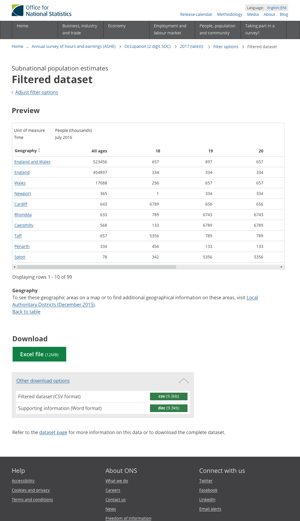
- Improve table preview: for example: replace the word 'value' with 'unit of measure', hide the code list columns, move common values to the list shown before table
- Exploring ways to display confidence interval markings
- Mocking up new design for web chat (so it looks like ONS)
- Exploring the next steps for a "find data by area" journey (Google Doc)
- Iterate on full width "release notification banner" (currently, some users think these are footers because they are big and grey)
Learnt
- New filter options page design was more successful
- When filtering datasets, if items are not in the expected place, users expect a search
- Download file needs a plain english name
- Users sometimes "go back too far", can their progress be maintained if they re-visit the same dataset?
- Some users expect the the current page to be repeated in the breadcrumb list - need to explore more
Sprint 12
15 Nov 2017 to 28 Nov 2017
Done
Learnt
- Users are less likely to download datasets that are zipped up
- Datasets are more likely to be downloaded if their title is less than 60 characters
- Visually imparied users can use of mix of assisitve tech (software magnification, high contrast, screen reader, keyboard only, mouse & keyboard)
- Discovered a keyboard bug that incorrectly selected all checkboxes
Sprint 11
1 Nov 2017 to 14 Nov 2017
Done
Learnt
- New table prototypes tested well with users
- Including a table of contents on the dataset landing page was a great way to give an "at a glance" view of the metadata available
- The show/hide component is sometimes missed, because it's not that obvious that it's interactive
- Time filter content needs to be more contextual e.g. "Add a single month" not "Add a single time"
- Download file is testing well, but it needs some simple contextual information, for example; dataset name, filters added, date customised
Sprint 10
19 October 2017 to 31 October 2017
Done
Learnt
- Users want to filter dates in this order of priority: latest date, single date, date range, custom mix of dates
- Navigating between release years causes big problems for users
- Users expect to be able to use breadcrumbs to go up a level to pick other release years
- Version history labelling could be improved (e.g. “original” and “revised”)
- Many users don't notice the "shopping basket" component
- Users are naturally drawn to maps but expect to be able to mix and match between different ways of interacting with them
Sprint 9
4 October 2017 to 17 October 2017
Done
Learnt
- Floating table of contents not being noticed
- User thought horizontal black bar below page intro was the end of the page
- Chart tooltip content is only available in the tooltip (it's easy to miss and not very accessible)
- 2 of 3 users preferred larger font size because it didn't strain their eyesight
- 2 of 3 users expected contact details to be at top of page
- Users confused when asked to add 2nd date range
- Users expect long lists to be grouped or structure somehow
- Users expect a link to other similar datasets from dataset landing page
- Users not keen on ow.ly links from social - they don't know what they are going to get
- If tweets cover difficult topics (e.g. abuse), users prefer no illustration (text alone is fine)
- Reordering content can give massive improvements on click throughs
- Some screen reader users find heading essential for navigation
- Buttons should be marked up as buttons, not p tags
- Labels and headings should follow the pattern of "plain english name, code" for example "Food K02000001"
Sprint 8
21 September 2017 to 3 October 2017
Done
Learnt
- Skip links need to send focus to the correct area
- Every interactive element needs a visual focus style
- All interactive elements need clear, consistent active, focus and hover styles
- Non-interactive elements shouldn't be focusable
- Links need to be unique and descriptive
- Colour contrast on charts, links and text needs to be improved
- Chart tooltips are only accessible via mouse (not keyboard)
- Areas need context: e.g. “Clifton (electoral ward) in Bristol”
Sprint 7
7 September 2017 to 20 September 2017
Done
- Closer integration of the web front-end and the API
- Realtime generation of a filtered CSV through the web front-end
- JavaScript enhancements to the cart so it updates instantly, without refreshing the page or additional action
- Improved the date filter so that the end date is updated based on the start date chosen by the user
- Added the "apply filters to latest dataset" alert
- Enabled the entire row to be clickable on the filter options page
- Design Sprint to tackle "find data by area" (Google Slides)
- Design Sprint prototype
- Built a backend events reporter to catch errors
Learnt
- If users see a map, they expect it to be interactive
- Most users get confused when shown multiple statistical areas for one area (for example, Cardiff Electoral Ward and Cardiff Civil Parish)
- Users expect to see data at all levels of the area navigation journey
Sprint 6
23 August to 6 September 2017
Done
Learnt
- After fleshing out the types of data we are storing in postgres, it made more sense to start moving our database to a mongodb datastore. This allowed us to store more complex data types and have quicker database reads
- Versions and instances share a lot of data, but we interact with them in 2 separate APIs and store them twice. Moving instances into the dataset API will prevent duplication of data and time spent copying it over.
Sprint 5
9 August to 23 August 2017
Done
Learnt
- When selecting a range, users expected the end date to pre-populated with start date
- Users expect to wait for downloads to generate, but need to be kept informed
- Links should be more descriptive, for example 'view 4' should say 'view 4 regions'
- Repeated headings and links like "download this table" need to be unique and descriptive
- Users need to know what's changed between dataset editions
- Charts need to have useful descriptions (alternative text) or be available in tabular form
- Table previews need to show all columns, but only a few rows
- Functionality should be clear from the way something looks, for example a drop down menu needs to have a arrow that acts as a visual cue
- Consistency is very important for accessibility
Sprint 4
26 July to 8 August 2017
Done
Learnt
- Acronyms cause confusion, users don't understand that UA means Unitary Authority
- Including the word 'save' on the primary button makes users feel more confident even if auto-save happens in the background
- Labelling needs to be clear when search boxes don't search the entire site
Sprint 3
July to 25 July 2017
Done
Learnt
- Andy can make decent cookies
- Mobile traffic is as at 23%, tablet traffic is at 7%
- iOS autocorrect does a bad job of autocorrecting acronyms that users type into search (like GDP, RPI and QMI)
- The floating table of contents is causing multiple issues
- Long legend text on time series charts are being cut off on smaller screens
- Zip files can't always be downloaded on iOS
Sprint 2
28 June to 11 July 2017
Done
Learnt
- Users find the breadcrumbs useful for navigating around the process
- Users need a table preview so they can check their filters
- Users need to know filesize before they download a spreadsheet
- Users need instant confirmation of what filters have been applied (also known as a basket)
Sprint 1
14 June to 27 June 2017
Done
Sprint 0
7 June to 13 June 2017
Done